Real World Data Sets are Messy: Case Study Elec2
Benchmark data sets that are ill documented provide harm to the ML community and the research output, even if they are “real world”. Recent work (link) put the spotlight on large language data sets, but the issue is present also in smaller data sets.
The Elec2 dataset provides a good case study for this. It describes electricity demand and prices in Australia during the 90’s. The data set is popular as a bench mark for model that handle distribution shift / concept drift. The data was first described in Splice2- Comparative Evaluation: Electricity Pricing, a technical report from 1999 by Michael Harries (link). He says the data was downloaded from http://www.tg.nsw.gov.au/ and that it is redestributed on http://www.cse.unsw.edu.au/mbh/context/elec.tar.gz. Both links are broken as of 2023-12-21. The author claims the data holds 45.312 instances from from 7 May 1996 to 5 December 1998 with one instance for each half hour.
import datetime
samples= (datetime.datetime(year=1998,month=12,day=6) - datetime.datetime(year=1996,month=5,day=7)) / datetime.timedelta(minutes=30)
print(f"In the specified datetime interval (including the full day of 5 Dec 1998) contains {samples} days. Compare to {45_312}. \nWe have {45312-samples} too many days.")
In the specified datetime interval (including the full day of 5 Dec 1998) contains 45264.0 days. Compare to 45312.
We have 48.0 too many days.
So already in the first mention of the datasets are there inconsistencies. The author claims there is a full day of data more than the date interval he specifies. I will assume there is one day extra at the end of the data.
Let’s download the data and take a look at it. I find two versions of the dataset online. One version in ARFF format, and one version in CSV format. They seems to hold the same content. ARFF was popular in the early 00’s ML scene since it is somwhat self-documenting.
I downloaded the ARFF version from www.openml.org, where the user Jan van Rijn claims this is the normalized version published by Joao Gama in 2009 accompanying his book section Learning with Drift Detection. Gama does not adress data quality, normalization or redistribution in his book. openml.org notes that most columns has been normalized to the interval [0,1].
import urllib.request
URL = "https://www.openml.org/data/download/2419/electricity-normalized.arff"
file = urllib.request.urlopen(URL).read().decode()
print(file[:500]) # print the first part of the file
@relation electricity-weka.filters.unsupervised.attribute.Normalize-S1.0-T0.0-weka.filters.unsupervised.attribute.ReplaceMissingValues

@attribute date numeric
@attribute day {1,2,3,4,5,6,7}
@attribute period numeric
@attribute nswprice numeric
@attribute nswdemand numeric
@attribute vicprice numeric
@attribute vicdemand numeric
@attribute transfer numeric
@attribute class {UP,DOWN}

@data
0,2,0,0.056443,0.439155,0.003467,0.422915,0.414912,UP
0,2,0.021277,0.051699,0.415055,0.003467,0.422915,0.41
We learn that ARFF is a string based storage with metadata in the header section, and a data section filled with csv data. Convert to pandas instead, to get simpler data management. I will only consider the demand data for New South Wales in this post, but the same analysis can be done for the other columns.
import pandas as pd
import scipy.io.arff
import io
data,_ = scipy.io.arff.loadarff(io.StringIO(file))
data = pd.DataFrame(data)
print(data.info())
data['day'] = data['day'].astype(int) # the ARFF reader treats the days as bytes-objects

# then restrict the exploration to the time-dimension and the demand
data=data[['date','day','period','nswdemand']]
print(data.head())
<class 'pandas.core.frame.DataFrame'>
RangeIndex: 45312 entries, 0 to 45311
Data columns (total 9 columns):
 #   Column     Non-Null Count  Dtype
---  ------     --------------  -----
 0   date       45312 non-null  float64
 1   day        45312 non-null  object
 2   period     45312 non-null  float64
 3   nswprice   45312 non-null  float64
 4   nswdemand  45312 non-null  float64
 5   vicprice   45312 non-null  float64
 6   vicdemand  45312 non-null  float64
 7   transfer   45312 non-null  float64
 8   class      45312 non-null  object
dtypes: float64(7), object(2)
memory usage: 3.1+ MB
None
   date  day    period  nswdemand
0   0.0    2  0.000000   0.439155
1   0.0    2  0.021277   0.415055
2   0.0    2  0.042553   0.385004
3   0.0    2  0.063830   0.314639
4   0.0    2  0.085106   0.251116
We will use seaborn to get a quick pairplot and understand the spread of the data. From this we learn:
dayshould be day-of-week, encoded 1-7. Seems ok.periodshould be half-hour of day, encoded 1-48, but normalized to[0,1]. Seems ok, but the histogram binning distorts the view.- The
datefield looks super awkward - we should have a uniform spread of data over time, but we get three bumps in the data around 0, 0.5 and 1. - The
nswdemandvariable looks okay.
import seaborn as sns
sns.pairplot(data=data,kind='hist',corner=True)
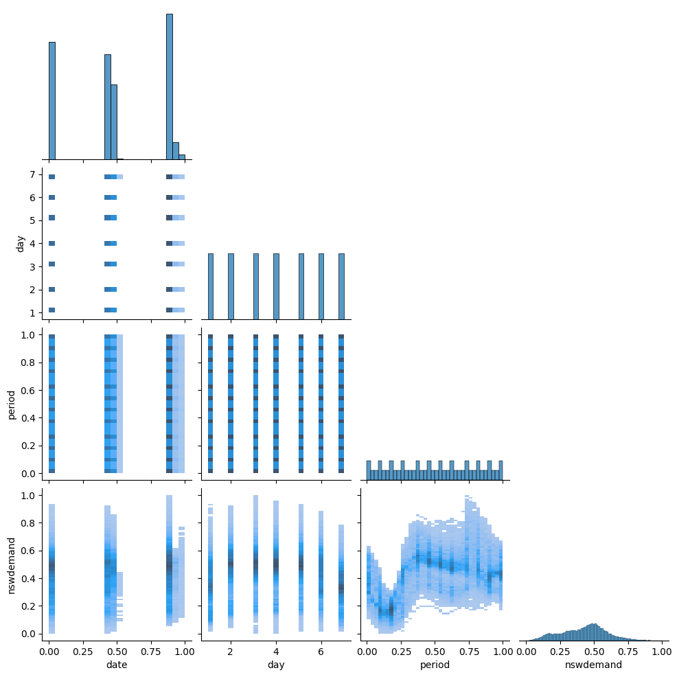
Because the date field is strange, we make a more systematic exploration of the date-information. Does the day, period and date columns make sense together?
The date-column looks strange being in three ‘piles’ in the histogram, instead of uniformly distributed. After some reading, I find in table 4 of the original publication (page 11), that dates were encoded as 6-digit integers, e.g. 970626 for 26 June 1997. Since data come from the years 96, 97 and 98, these form three “piles” in the histogram around 0, 0.5 and 1 when you normalize to [0,1]. We generate our own values for date and period and date, and see if they match the data.
my_datetime = pd.date_range(start='1996-05-07', freq='30min',periods = len(data))

expected_day = my_datetime.dayofweek +1
assert (expected_day - data['day']).abs().max() == 0, "The day number just rolls on"

expected_period = my_datetime.hour*2 + my_datetime.minute/30 + 1
normalized_expected_period = expected_period - expected_period.min()
normalized_expected_period /= normalized_expected_period.max()
assert  (normalized_expected_period - data['period']).abs().max() < 1e-6, "The period just runs on. :)"
data['period_rescaled'] = expected_period

expected_date = my_datetime.strftime('%y%m%d').astype(int)
normalized_expected_date = expected_date - expected_date.min()
normalized_expected_date /= normalized_expected_date.max()
print("This is not even almost zero", (normalized_expected_date - data['date']).abs().max(), "NOT OK!")
This is not even almost zero 0.4721237785400261 NOT OK!
Something is wong with the date column. MAybe the normalization is off?
# plot the normalized expected date against the actual date.
# this should be a straight diagonal line, but it is not.
import matplotlib.pyplot as plt
plt.scatter(normalized_expected_date, data['date'],s=3.0,marker='x')
plt.plot([0,1],[0,1],color='black',linestyle='--',alpha=0.5)
plt.xlabel("normalized expected date")
plt.ylabel("actual date")
Text(0, 0.5, 'actual date')
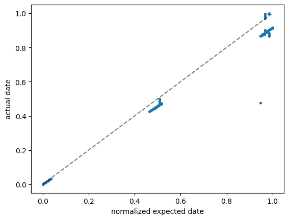
Most data lies on a straight line, but with some other scale factor. And there are some outliers.
Above, we went from known dates to a normalized format numbers in [0,1], we can also go “backwards” with the offset and slope we expect, and adjust the slope until the linear relationship works well for most data.
What is this best slope? To be outlier-robust, we minimise the MAD (median absolute deviation).
import numpy as np
adjustments = np.linspace(1900,1910,200)
fraction = []
for adjustment in adjustments:
    rescaled_actual_date = data['date']*(981205 - 960507 + adjustment) + 960507
    fraction.append((rescaled_actual_date - expected_date).abs().median())
plt.figure()
plt.plot(adjustments,fraction)
plt.ylabel(f"Mean Absolute Deviation")
plt.xlabel("Adjustment")

# from the plot
best_adjustment = adjustments[np.argmin(fraction)].round().astype(int)
print(f"best_adjustment is {best_adjustment}")
end_date = 981205 + best_adjustment
print(f"The rescale formula becomes `rescaled_actual_date = data['date']*({981205+best_adjustment} - 960507) + 960507`")
best_adjustment is 1904
The rescale formula becomes `rescaled_actual_date = data['date']*(983109 - 960507) + 960507`
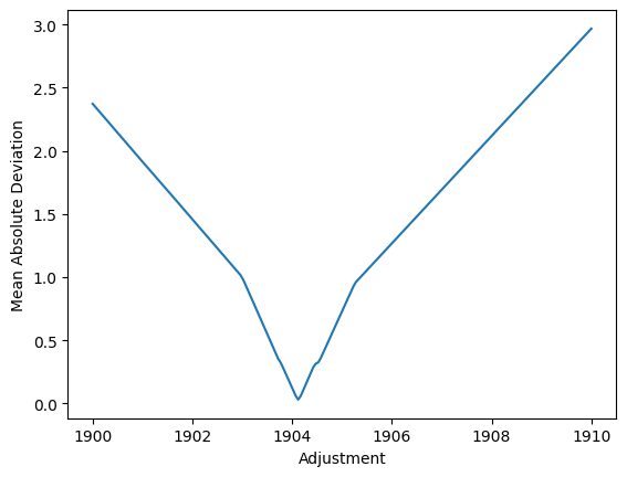
Above code computes a rescaling-formula. It finds that the max-date used in rescaling is 983109, but that is not a date. But it does look like flipped day and month values… Maybe some data points had bad date formats in the input? Maybe day and month were flipped? We can still plot the data with the rescaling, and see if it makes sense.
best_rescaled_actual_date = data['date']*(981205 + best_adjustment - 960507) + 960507
fig,ax = plt.subplots(figsize=(10,5))
ax.plot(np.arange(len(expected_date)), expected_date, label="expected date")
ax.plot(np.arange(len(best_rescaled_actual_date)), best_rescaled_actual_date, label="best rescaled actual date")
ax.legend()
ax.set_xlabel("row number")
ax.set_ylabel("date")

# Zoom in may 1996
x1, x2, y1, y2 = 0, 31*48, 960505, 960505+31  # subregion of the original image in data-coordinates
axins = ax.inset_axes(
    [0.05, 0.15, 0.15, 0.6], #   [left, bottom, width, height] in axes coordinates (0 to 1)
    xlim=(x1, x2), ylim=(y1, y2), xticklabels=[], yticklabels=[])
axins.plot(np.arange(len(expected_date)), expected_date, label="expected date")
axins.plot(np.arange(len(best_rescaled_actual_date)), best_rescaled_actual_date, label="best rescaled actual date")
ax.indicate_inset_zoom(axins)

# Zoom in to october 1997
x1, x2, y1, y2 = 25000, 25000+60*48, 971000, 971000+300
axins = ax.inset_axes(
    [0.3, 0.01, 0.3, 0.35],
    xlim=(x1, x2), ylim=(y1, y2), xticklabels=[], yticklabels=[])
axins.plot(np.arange(len(expected_date)), expected_date, label="expected date")
axins.plot(np.arange(len(best_rescaled_actual_date)), best_rescaled_actual_date, label="best rescaled actual date")
ax.indicate_inset_zoom(axins);

# Zoom in to early may 97. Here, the same date is repeated SAME DATE TWICE! Is this the real explanation for the one-day-extra problem?
x1, x2, y1, y2 = 17000, 18000, 970490, 970520
axins = ax.inset_axes(
    [0.3, 0.6, 0.3, 0.35],
    xlim=(x1, x2), ylim=(y1, y2), xticklabels=[], yticklabels=[])
axins.plot(np.arange(len(expected_date)), expected_date, label="expected date")
axins.plot(np.arange(len(best_rescaled_actual_date)), best_rescaled_actual_date, label="best rescaled actual date")
ax.indicate_inset_zoom(axins);
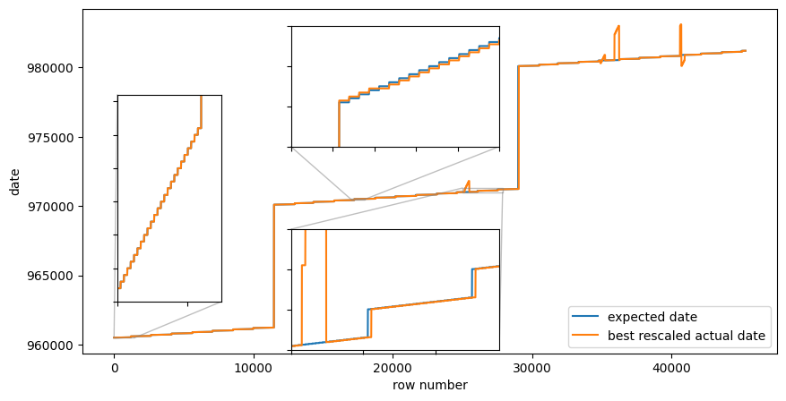
With this rescaling, the actual date and the expected date start of following each other for quite some time, but during the mid third of the data (dates somewhere around late 1997) the date field increments much faster than expected, and then comes back down again. Furthermore, there is a date that occurs twice as many times as it should, which makes the month breaks lag between the two date fields. Something more is amiss!
Is the data maybe dirty there, or rows in the data files are mis-sorted? Does the data series look strange around those parts?
strange_idx = (best_rescaled_actual_date - expected_date).abs().gt(50) # more than a month off
fig,ax = plt.subplots(figsize=(15,10))
ax.scatter(my_datetime[~strange_idx], data['nswdemand'][~strange_idx],label="normal",s=2,marker='x');
ax.scatter(my_datetime[strange_idx], data['nswdemand'][strange_idx],label="date-outliers",s=3,marker='x');
ax.legend()
<matplotlib.legend.Legend at 0x7f839d38a440>
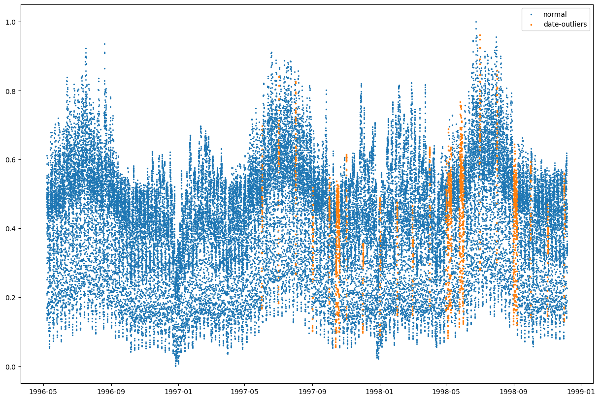
Not really. The demand data seems ok, despite the date-column seems to be broken.
We investigate instead that specific date that is a duplicate! I did by some manual inspection to see that the duplication happens in row 17376 to 17376+2*48.
assert 1==len(data.iloc[17376:17376+2*48]['date'].unique()), "a single unique date is repeated for two days!"
a= data.iloc[17376:17376+2*48]['nswdemand'].to_numpy().reshape(2,-1).T # a single unique date is repeated!
assert (a[:,0] == a[:,1]).all(), "the demand is repeated identically!"
The exact demand repeats twice!!! My only explanation is that the same data occus twice!
But the day- and period-columns did not repeat. 😲 So I suppose those two columns were generated from row number, rather than from the date.
My suspicion is that for rows after 17376+48, the day field is shifted by 1 as a consequence. What really is a monday (1) gets recorded as a tuedsday (2) etc.
I want to try this hypothesis out by the following experiment: take a random period of day. I pick noon (period 12)
For this period, I suppose there is some distribution, from which we draw the demand.
But after this duplication the distribution is shifted by 1.
The wasserstein distance between period=i and period=i+1 should be minimal before/after the shift.
import scipy.stats

data['is_shifted'] = (data.index > 17376+48)
data['period_rescaled'] = (data['period']*(48-1) +1).astype(int)
ress = []
for day1 in range(1,7+1):
    for day2 in range(1,7+1):
        samp1 = data['nswdemand'][~data['is_shifted'] & (data['period_rescaled']==12) & (data['day']==day1)] # the monday data from before the break
        samp2 = data['nswdemand'][ data['is_shifted'] & (data['period_rescaled']==12) & (data['day']==day2)] # the monday data from before the break
        ress.append((day1,day2,scipy.stats.wasserstein_distance(samp1,samp2)))
ress = pd.DataFrame(ress,columns=['day before','day after','val'])
df = ress.pivot(index=['day before'],columns='day after',values='val').round(2)
print(df)

# which shift is best? no shift, one shift or something else?
for shift in range(7):
    print(f"shift={shift} => Total wasserstein distance: {sum(df.iloc[i,(i+shift) % 7] for i in range(7)):.2f}")
day after      1     2     3     4     5     6     7
day before
1           0.15  0.03  0.06  0.06  0.06  0.06  0.09
2           0.19  0.01  0.02  0.03  0.03  0.03  0.12
3           0.19  0.01  0.03  0.03  0.03  0.03  0.12
4           0.19  0.01  0.03  0.03  0.03  0.03  0.12
5           0.18  0.01  0.03  0.04  0.04  0.04  0.11
6           0.04  0.14  0.17  0.18  0.17  0.17  0.03
7           0.03  0.21  0.24  0.25  0.24  0.24  0.10
shift=0 => Total wasserstein distance: 0.53
shift=1 => Total wasserstein distance: 0.21
shift=2 => Total wasserstein distance: 0.51
shift=3 => Total wasserstein distance: 0.80
shift=4 => Total wasserstein distance: 0.83
shift=5 => Total wasserstein distance: 0.83
shift=6 => Total wasserstein distance: 0.77
The wasserstein distance is actually the smallest when the shift is precisely `1. This is not really a rigorous test, but it provides evidence that there is a duplicate day in the data.
Redoing analysis with one day deleted
I conclude rows 17376:17376+48 are indeed duplicates, and that the day-column must be shifted by -1 for rows after 17376+48. One can equally well just ignore that column and compute it from the date column.
data,_ = scipy.io.arff.loadarff(io.StringIO(file))
data = pd.DataFrame(data)
data['day'] = data['day'].astype(int) # the ARFF reader treats the days as bytes-objects

# then restrict the exploration to the time-dimension and the demand
data=data[['date','period','nswdemand']]
data.drop(index=data.index[17376:17376+48],inplace=True) # drop the duplicate
data.reset_index(drop=True,inplace=True)
data['my_datetime'] = pd.date_range(start='1996-05-07', freq='30min',periods = len(data))
data['my_day'] = data['my_datetime'].dt.dayofweek +1
data['my_period'] = data['my_datetime'].dt.hour*2 + data['my_datetime'].dt.minute/30 + 1
data['my_date_int'] = data['my_datetime'].dt.strftime('%y%m%d').astype(int)
data['date_int'] = 960507 + data['date'] * (981205 - 960507) / data['date'].iloc[-1] # similar rescaling as before, but force the end-date to be correct
print(data.info())
<class 'pandas.core.frame.DataFrame'>
RangeIndex: 45264 entries, 0 to 45263
Data columns (total 8 columns):
 #   Column       Non-Null Count  Dtype
---  ------       --------------  -----
 0   date         45264 non-null  float64
 1   period       45264 non-null  float64
 2   nswdemand    45264 non-null  float64
 3   my_datetime  45264 non-null  datetime64[ns]
 4   my_day       45264 non-null  int32
 5   my_period    45264 non-null  float64
 6   my_date_int  45264 non-null  int64
 7   date_int     45264 non-null  float64
dtypes: datetime64[ns](1), float64(5), int32(1), int64(1)
memory usage: 2.6 MB
None
Lets make the similar plot as before, to see which kinds of errors we have now.
fig,ax = plt.subplots(figsize=(10,5))
ax.plot(data['my_datetime'], data['my_date_int'], label="expected date")
ax.plot(data['my_datetime'], data['date_int'], label="best rescaled actual date")
ax.legend()
ax.set_xlabel("row number")
ax.set_ylabel("date")

# Zoom in 1996
x1, x2, y1, y2 = (1996.25-1970)*365, (1997-1970)*365, 960505, 961201  # subregion of the original image in data-coordinates1
axins = ax.inset_axes(
    [0.05, 0.15, 0.15, 0.6], #   [left, bottom, width, height] in axes coordinates (0 to 1)
    xlim=(x1, x2), ylim=(y1, y2), xticklabels=[], yticklabels=[])
axins.plot(data['my_datetime'], data['my_date_int'], label="expected date")
axins.plot(data['my_datetime'], data['date_int'], label="best rescaled actual date")
ax.indicate_inset_zoom(axins)

# Zoom in end 1997
x1, x2, y1, y2 = (1997.75-1970)*365, (1998-1970)*365, 970901, 972009  # subregion of the original image in data-coordinates1
axins = ax.inset_axes(
    [0.35, 0.05, 0.20, 0.35], #   [left, bottom, width, height] in axes coordinates (0 to 1)
    xlim=(x1, x2), ylim=(y1, y2), xticklabels=[], yticklabels=[])
axins.plot(data['my_datetime'], data['my_date_int'], label="expected date")
axins.plot(data['my_datetime'], data['date_int'], label="best rescaled actual date")
ax.indicate_inset_zoom(axins)

# Zoom in end of 1998
x1, x2, y1, y2 = (1998.9-1970)*365, (1998.95-1970)*365, 981115, 981231  # subregion of the original image in data-coordinates1
axins = ax.inset_axes(
    [0.75, 0.05, 0.20, 0.35], #   [left, bottom, width, height] in axes coordinates (0 to 1)
    xlim=(x1, x2), ylim=(y1, y2), xticklabels=[], yticklabels=[])
axins.plot(data['my_datetime'], data['my_date_int'], label="expected date")
axins.plot(data['my_datetime'], data['date_int'], label="best rescaled actual date")
ax.indicate_inset_zoom(axins);
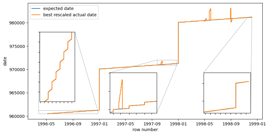
We learn that the data is now changing months and years as it should, but that there still are some strange spikes in the data. I get have the feeling that maybe those are instances when day and month have been flipped in the integer representation.
data[data['my_date_int'] != data['date_int'].round(1)][['my_date_int','date_int']].round(1).drop_duplicates()
| my_date_int | date_int | |
|---|---|---|
| 25104 | 971012 | 971210.0 |
| 25152 | 971013 | 971310.0 |
| 25200 | 971014 | 971410.0 |
| 25248 | 971015 | 971510.0 |
| 25296 | 971016 | 971610.0 |
| 25344 | 971017 | 971710.0 |
| 25392 | 971018 | 971810.0 |
| 34848 | 980503 | 980305.0 |
| 34896 | 980504 | 980405.0 |
| 34992 | 980506 | 980605.0 |
| 35040 | 980507 | 980705.0 |
| 35088 | 980508 | 980805.0 |
| 35136 | 980509 | 980905.0 |
| 35856 | 980524 | 982405.0 |
| 35904 | 980525 | 982505.0 |
| 35952 | 980526 | 982605.0 |
| 36000 | 980527 | 982705.0 |
| 36048 | 980528 | 982805.0 |
| 36096 | 980529 | 982905.0 |
| 36144 | 980530 | 983005.0 |
| 40560 | 980830 | 983008.0 |
| 40608 | 980831 | 983108.0 |
| 40656 | 980901 | 980109.0 |
| 40704 | 980902 | 980209.0 |
| 40752 | 980903 | 980309.0 |
| 40800 | 980904 | 980409.0 |
| 40848 | 980905 | 980509.0 |
Visual inspection of these result show that all the date errors now are flipped month and day.
This indicates that we should just ignore the date column altogether!
After all this work, we conclude that 48 certain rows in the data should be deleted, and that the day and date columns should be ignored.
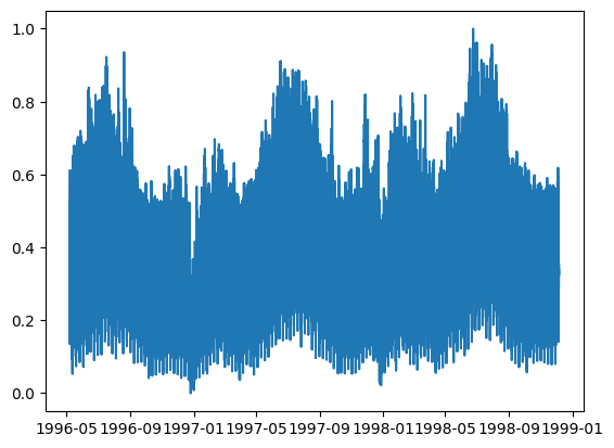
We plot the final time series.
data,_ = scipy.io.arff.loadarff(io.StringIO(file))
data = pd.DataFrame(data)
data = data[['nswdemand']]
data = data.drop(index=data.index[17376:17376+48])
data['datetime'] = pd.date_range(start='1996-05-07', freq='30min',periods = len(data))
plt.plot(data['datetime'],data['nswdemand'])
assert data['datetime'].dt.strftime('%y%m%d').astype(int).max() == 981205, "The end date is not correct"
assert data['datetime'].dt.strftime('%y%m%d').astype(int).min() == 960507, "The start date is not correct"
It takes SO much time to do data archeology. Digging through internet, comparing data files obtained from different mirrors. Hunting down the publications that presented the data sets. Doing descriptive statistics. Finding bugs. Generating hypotheses about the data. Un-cleaning the data. Re-cleaning the data. All of this takes time.
Please learn from my investigations! The conclusions I make from this work is:
- Continue to use the Elec2 dataset for benchmarking time series algorithms. But do delete row 17376 to (but not including) 17376+48 and ignore columns
dateandday. - I have not investigated that this makes sense for the other data columns (prices and demand for Victoria). You should look into that if you need those columns.
- Do not perform too much data cleaning on data that you will redistribute for use in benchmarking. It is better to leave the data dirty, and provide a script for data cleaning. This way, any problems in the data can be read and understood by users of the data set. If you clean the data, you will hide the problems while not really make them go away. Consider distributing two versions of the data; one clean and one honest.
